Good morning friends. I have been following the Doc’s orders to rest and slow down and limit my screen time, thus my absence. However, when I found out that Benjamin Moore’s color of the year was such a bold choice with quite the fitting name of Caliente, I had to hop on here and blog about it! You know I am all about the bold and the beautiful and this color delivers!
When asked in an interview by Architectural Digest on how she would describe Caliente, Ellen O’Neill of the Benjamin Moore team responds, “..‘OK you can’t live in a shocking color. You’ve got to live in a warm, seductive tone.’ We spread them all out and we arrived at Caliente. It was very charismatic. It lured and it beckoned. It wasn’t shocking. It has an almost a brown undertone which makes it soothing. I kept thinking of red gallery walls in a stately mansion that really showcased beautiful oil paintings or ephemera. Those stately reds; intimate reds. That’s how we arrived at that specific color.”

When I read of this year’s color choice, I immediately thought of designer, Miles Redd because he is known for punctuating his spaces with hints of red or boldly embracing the hue in his interior designs. The two spaces above from his portfolio are perfect examples.

traditional home


pinterestIf you’re timid to try this color on your walls, embracing it with accessories is another option


A red smeg, anyone?

Painting an architectural element Caliente is a great way to add a pop to a neutral space.

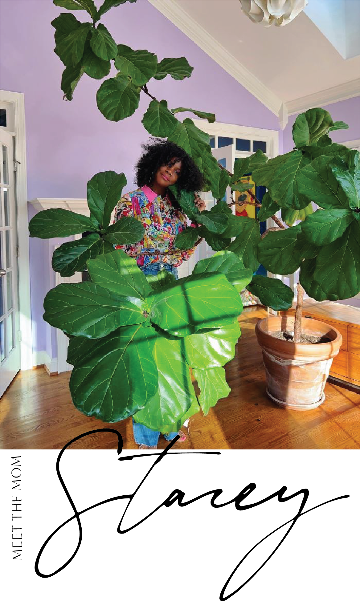
black girls killin it via pinterest
Get caliente with your lip color-who doesn’t love a red lip, right?
So what do you think about Benjamin Moore’s color of the year for 2018? While I have dosages of it as accessories in my home, I don’t have it on my walls. I am an orange kind of girl but I have painted a similar hue in a past project before.